

On choosing typography
Choosing type for Nearly Perfect, and designing a book
This post first appeared on type.lol. I co-founded type.lol with Mark before he took it to another level. If you’re ever looking for handcrafted typefaces, type.lol is the place to find all the good foundries, big and small.
If you care to look behind the curtain of how I went about type choices and designing Nearly Perfect, this one is for you.
The reason I decided to design, typeset, and illustrate the book was a creative decision. Kicking off the project, I realized that my opinionated design takes would quickly become a nightmare working environment for any would-be collaborators. I wanted to take the responsibility of designing the book from end to end.
Luckily the book, type-wise, was fairly straightforward. I needed to nail the heading and body type and knew I could figure out the rest.
Given this was a personal project, I felt comfortable leaning into to more of my own preferences. My personality could be described as a medium weight grotesk typeface.
I started doing type studies.
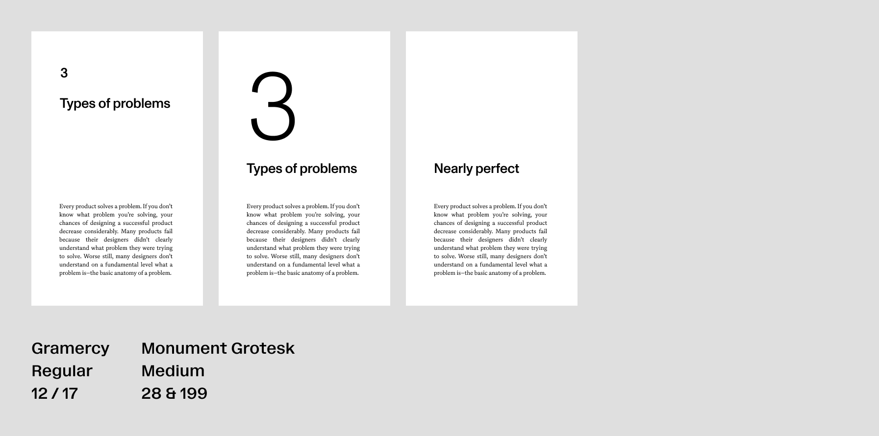
After some early exploration I knew I wanted a sans for headings and a serif for the body. I’m dyslexic, so I have a preference for serifs on longform text. You’ll see I tend to prefer more leading than would be standard. This first one was Gramercy and Monument Grotesk from Dinamo. I don’t think you have to stick with the same foundry for type pairings, but there’s something to it.
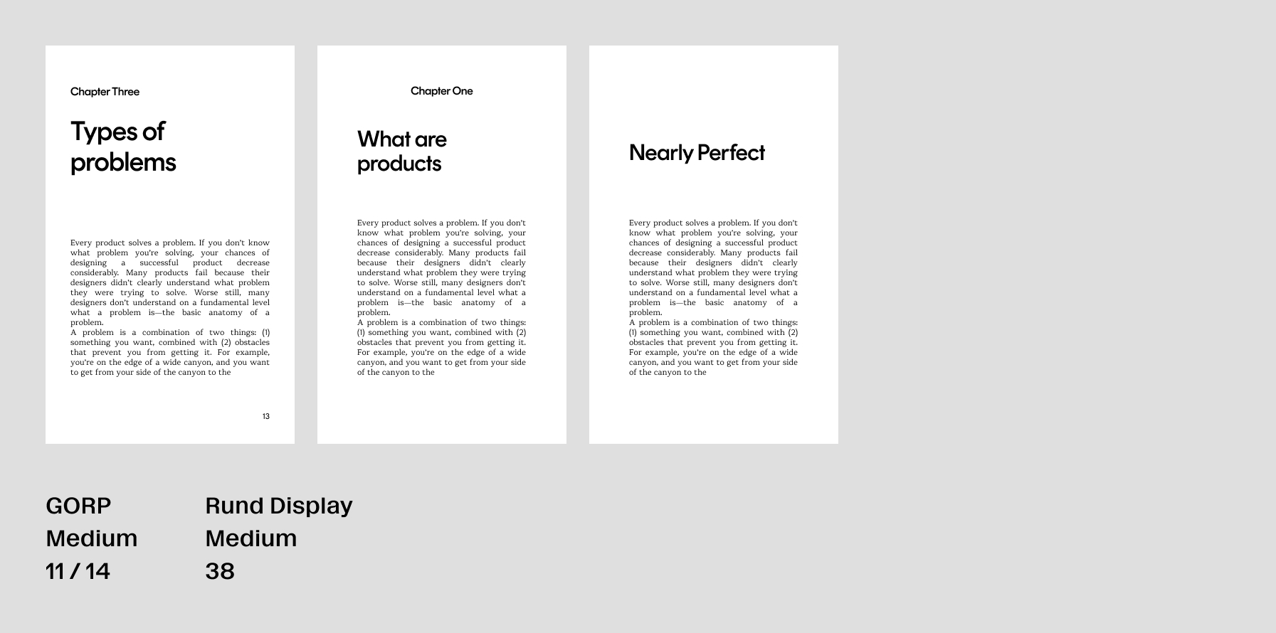
Gramercy was nice for the longform text, but it was a little too nice. I wanted the manuscript to come across a bit more playful and self-aware. I turned to our good pal Mark for the typeface he’s releasing: GORP.
But, Mark is a perfectionist. And the timeline of GORP’s release didn’t meet the timeline of the book’s release. Keep an eye out for the release of this. I’ll have to use this one in the next book.
I ended up landing on Tiempos for the longform text. I hated myself for this initially. I grew up professionally in a time where everyone was using Tiempos (from the great and powerful Klim) for everything to from websites to pamphlets. As it turns out, Tiempos is used heavily for a reason. It’s really, really nice. I personally like the high x-height for readability. And it perfectly strikes the chord of being simultaneously friendly and serious.
With Tiempos chosen, I just needed to find something for the headings.
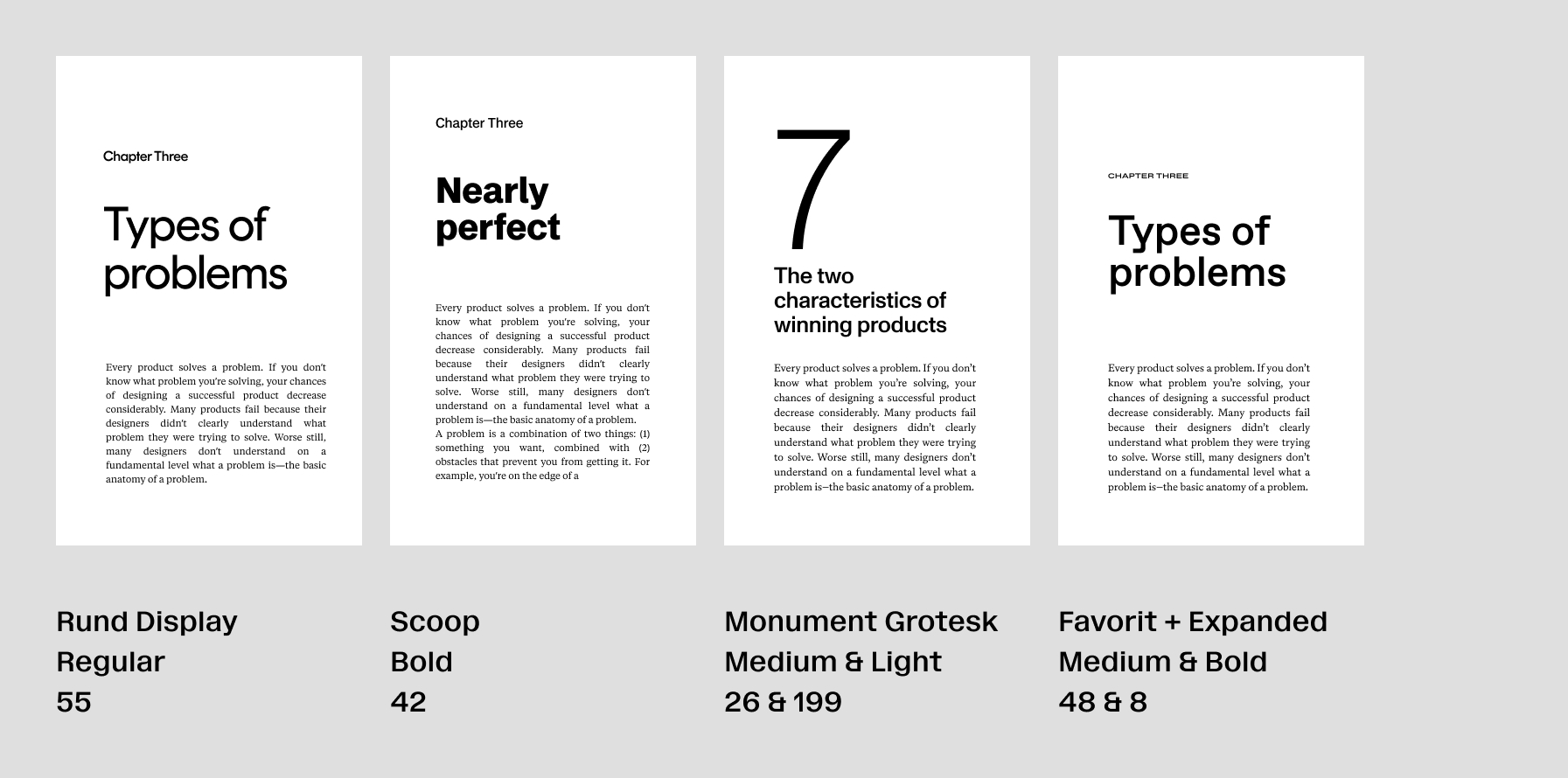
I tried Rund and Scoop (Letters from Sweden) Monument Grotesk (now paired with Tiempos) and Favorit (more from Dinamo).
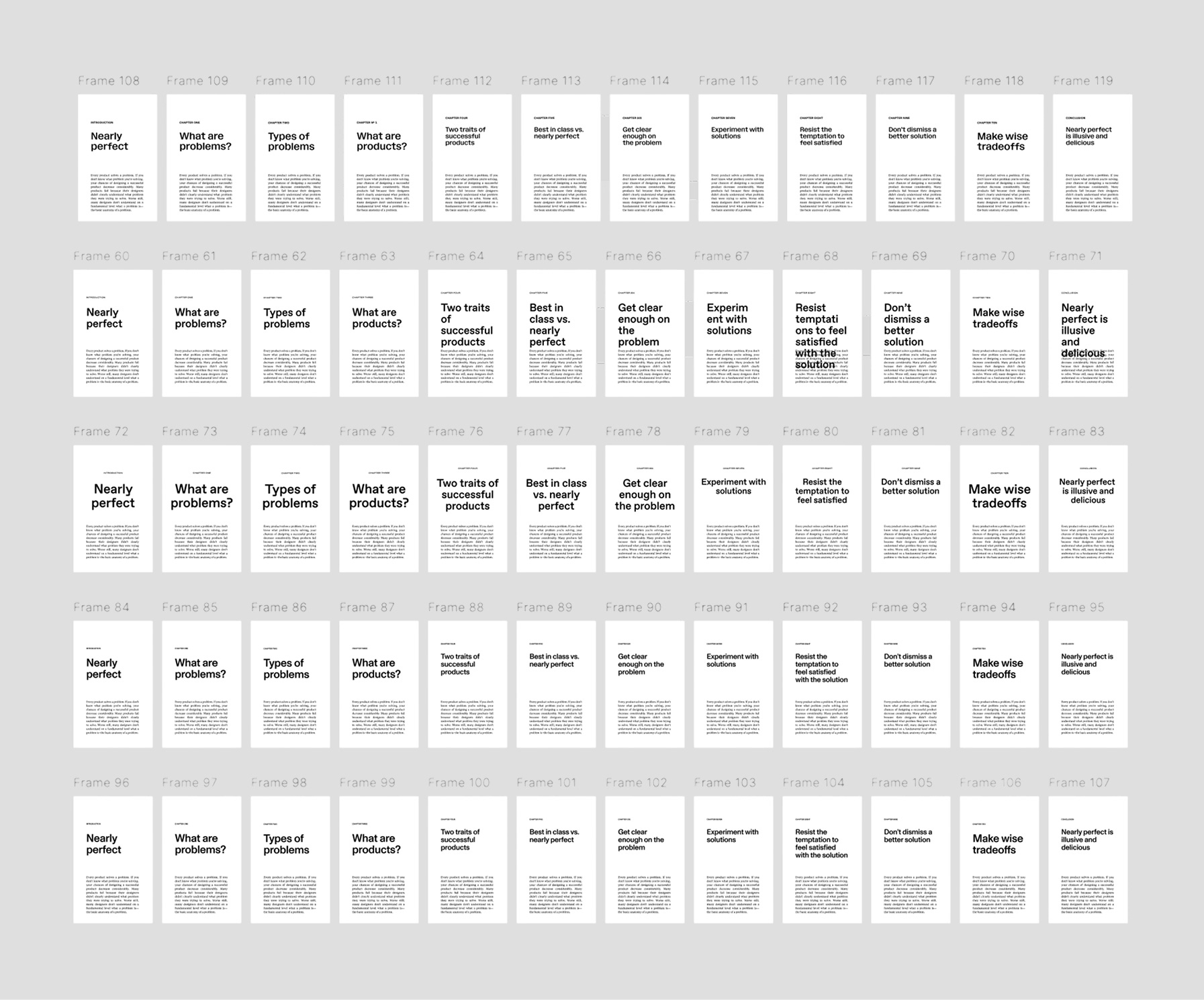
I pulled the content from every chapter for each of these headings, as I wanted to see how every chapter heading would make it’s way onto the page.
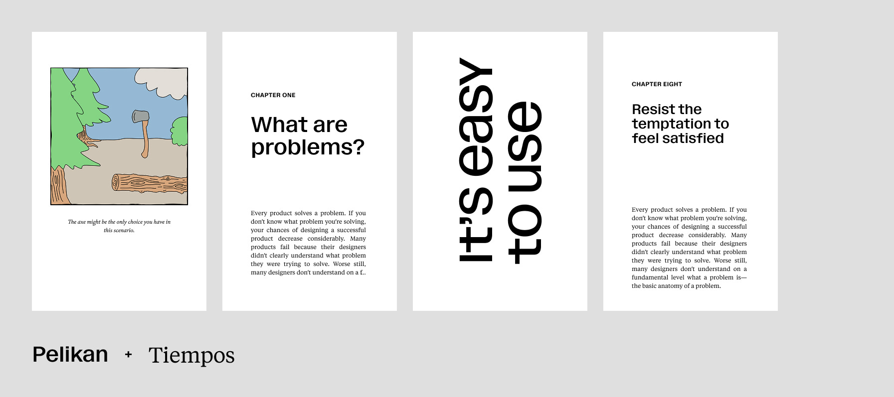
Then I found this typeface called Pelikan. It’s grotesk-like with attitude. The x-height of Pelikan also seemed to pair nicely with the high x-height of Tiempos. And it has a—very fun—unicase alternate that I got to play with.
The end result was pairing Pelikan (Dinamo) with Tiempos (Klim) for the final product. Using Pelikan for tables and quotes, while using Tiempos italic for illustration captions.
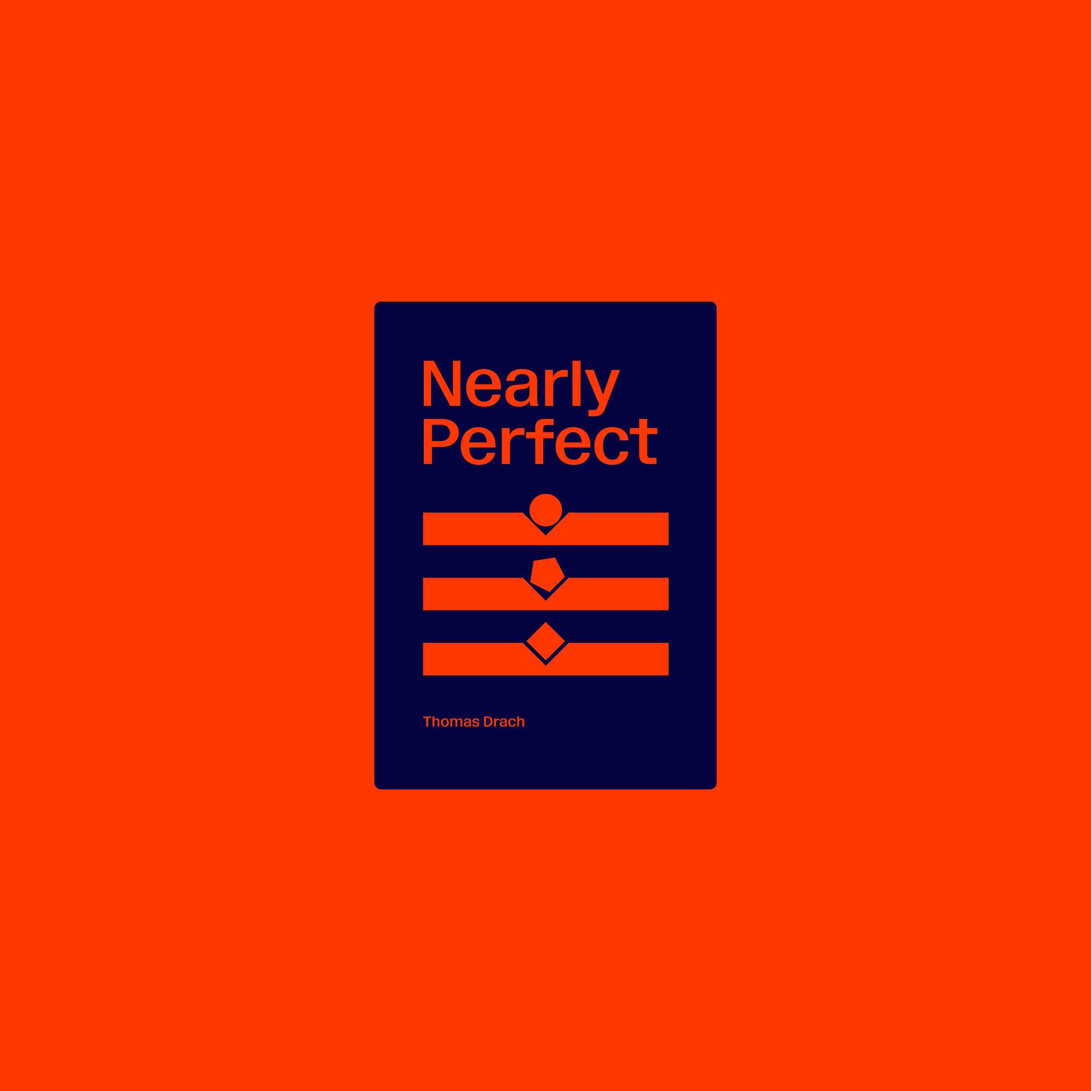
Pelikan would also find it’s way on to the cover. Thanks for the assist Mark.
While creating this type pairing I was also: creating the illustrations, fine tuning the margins and gutters, and learning the ins-and-outs of InDesign. The details I had recognized in great typesettings I now had to implement on my own.
Ultimately, after more drafts and prints than I dare admit, we were design complete for Nearly Perfect. Is it flawless? Hardly. I embraced the near-perfect results because they represent the core tenant of the book: solving problems thoughtfully, in a way that offers care to the people experiencing the end product. Shoot for the stars and hit the moon type of stuff.
Here’s the link to book in case you’re wanting to dive deeper.
Until next time!