


It’s really clear that the most precious resource we all have is time.
Steve Jobs
In the opening scene of the movie Inception, Leo looks at his watch, it’s ticking in seconds, then speeds up 2X, then 10X. He’s in a dream, and he’s bending time.
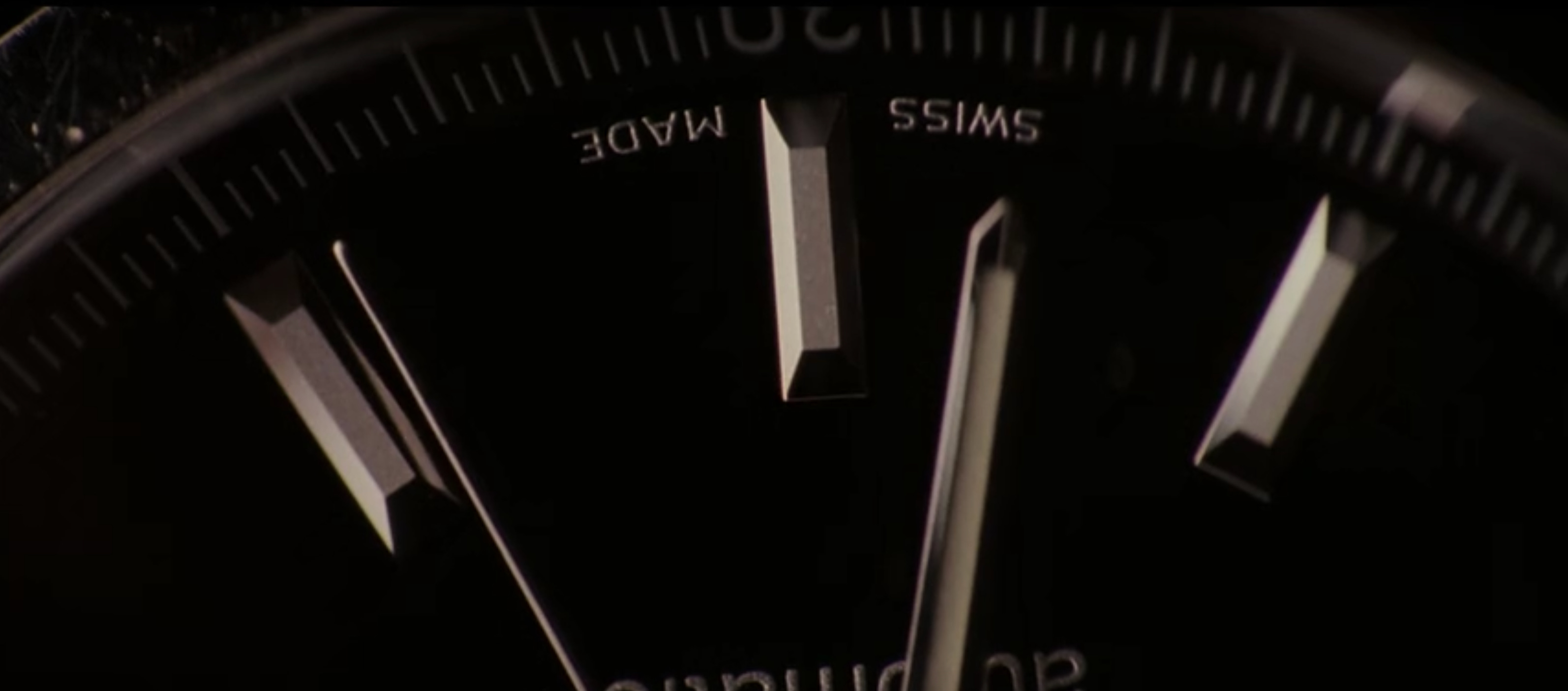
Time is not a fixed object in the dream world, in the movie Inception, or in real life. Though we probably won’t get into Einstein here. We measure our life in time, we use calendars, and we can design with time as well.
Design and Hierarchy
As designers we learn a lot of techniques for hierarchy. This is essentially what we do, arrange the hierarchy on a page. You first read the this post’s heading before reading this sentence. A designer should be able to manipulate different techniques: typography, information architecture, size, and color to determine when you see something.
This is based on Gestalt psychological theory. We don’t perceive individual objects, we perceive objects as a whole. We humans are great recognizers of patterns.
The idea that design is part of a whole is antiquated. There never is a whole! It’s constantly moving and reshaping. As digital designers, we operate in a sort of space-time, not just 2D or 3D space. Where many of these traditional techniques come from.
The only hierarchy that matters is time. As digital designers, we have an opportunity to use other objects (sound, motion) that you may not have access to if you're designing a poster. crystalcultures calls this…
the choreography of attention (which could simply be regarded as information hierarchy in time instead of space).
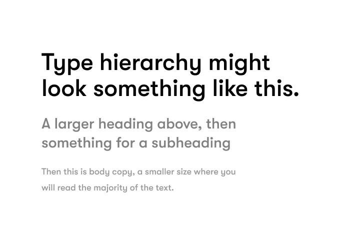
When you look at type hierarchy, it might look something like this...
What does something look like when you apply the hierarchy of time? Here's what it looks like when you have two sides with two different priorities
(get you reading an article about a pandemic, then try and grab your email)
Designing with time
Instead of starting with techniques of typography and color (you should still use them eventually), you can approach designs with the concept of time. You can create a sort of flow chart for what you want people to see and when, and use a Q&A format.
With my work at Mixpanel, I might be designing a particular report to visualize a subset of data. I could ask:
What do I want the order of information to be?
A user might have a query on their data, then expect to see a chart or visualization with the manifestation of it.
1. query information
2. chart with data
Then you can ask questions:
A. What if they didn't write the query?
B. What if the query isn't what they hoped?
C. What if they got to the chart and they need to go further?
Then I'll create a new flow diagram.
1. query information
1A. Show a quick summary of the query for easy digestion of the data
1B. Make it clear what next actions they can take on the query
1C. Give them tools on the chart itself so they can mold and manipulate what they're looking at
I can then use the "traditional" design techniques we talked about to deliver on this. If I need to interrupt the flow of time, I can use a more contrasty color, or bolder type. I can delay injecting new information, then use motion to bring it in at exactly the right time.
Design with Time Framework
Create a quick outline of the order of information (IA for nerds)
Ask questions from the user perspective inside the gaps
Apply your “traditional” design skills to answer the questions in the timeline
Read about the theory of relativity and apply it to design thinking
(you don’t have to do #4)
This transforms design for me: using the concept of time vs. technique. And bending time on itself when necessary. I just need a "kick" to get back in to the real world.
That's all for this one. Cheers, and godspeed.